LogAnalysis: Open-Source Web Tool For Geographic Business Intelligence
Context
I studied ASI (Architecture of Information Systems) at the INSA of Rouen, and during the second semester of the 4th year and the first semester of the 5th year, students work on a big R&D-like industrial project (PIC, for INSA Certified Project) for a company, carried out by teams of students.
5 projects are realized by 6 teams of 7 to 9 students during 1 scholar year, at a pace of 25 to 28 hours per week. One of those team work as a subcontractor for another team, and this team only exist during the first half of the project.
Subject
The subject my team worked on was to make an Open Source web tool allowing each and every one to be able to do Geographical Business Intelligence (GeoBI) as easily as possible, without prior knowledge of the “theory” of GeoBI.
This subject was proposed by our client, the Public Research Center Henri Tudor, based in Luxembourg, now called Luxembourg Institute for Science and Technology (LIST). The subcontractor team worked with mine on this subject.
Geographical Business Intelligence
To summarize quickly, Business Intelligence (BI) allows you to analyze big quantities of data, usually structured around lots of dimensions. For example revenue as a function of time, geography, clients, business sector, products, etc.
Business Intelligence allows you to analyze these masses of data, allowing you to make up your decisions based on those.
We can split Business Intelligence into 3 big steps:
- Collection of data to constitute a structured database
- Selection and processing of data
- Visualization of the results of the data processing
Collection of data
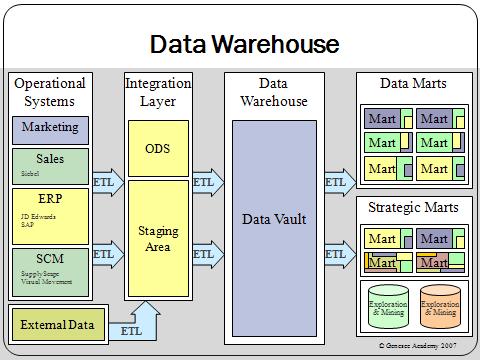
This preliminary step of Business Intelligence was not part of the project and is specific to each Information System. The goal is to collect data coming from multiple sources in order to constitute the most accurate and complete database possible. These data are stored in data warehouses and data marts. They will constitute OLAP databases.
Selection and processing of data
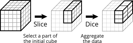
The first step of any BI analysis is to select which part of the data is interesting regarding the study you want to do (e.g.: select data for France in 2014 only). This is an OLAP slice.
Then, the most common data processing is to aggregate the data to get the most relevant results (e.g.: aggregate by month and department). This is an OLAP dice.
This is – in a very simplistic way of course – the principle of OLAP: limit the range of data studied and aggregate those at the most relevant level.
Visualization of the results
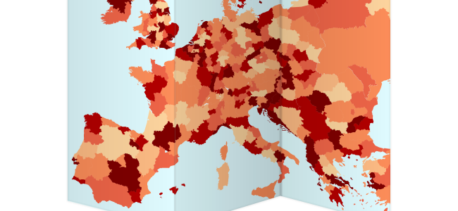
The second step of a BI analysis is to render the data for the user. The easiest display is of course the table. However, it is not the most practical way to interpret the data. We therefore use graphics, choropleth map, etc.
Goals of the project & demonstration
The project is developed as an Open Source web interface that integrates into the already existing web app GeoNode, it is available on GitHub. The main goals of the project were to:
- Load and process data using the OLAP database GeoMondrian
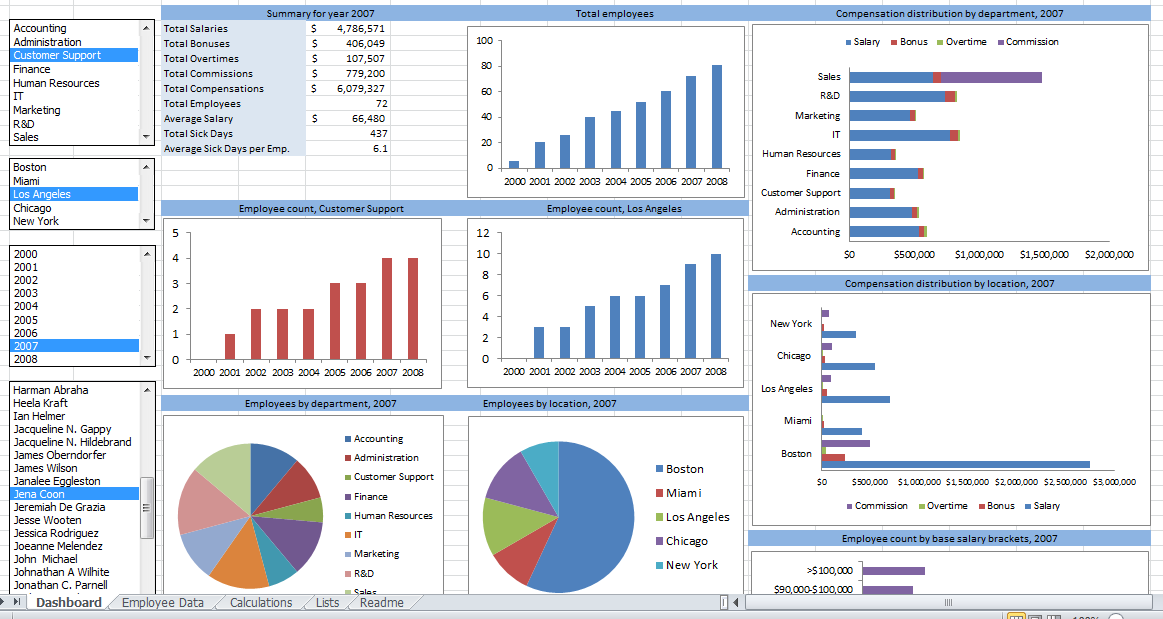
- Display results on various charts: choropleth map, pie chart, bar chart, bubble chart, table, word cloud
- Allow interaction on the charts to let the user query the OLAP database and do BI analyses:
- Filtering (OLAP slice) by clicking
- Dimensional zooming (OLAP drill-down and roll-up allowing to change both slice and dice) by mouse scroll. For example, a drill-down on France will display data for regions of France. Different variations of drill-down are available: simple (on 1 element), multiple (on more than 1 element), partial (drill-down while keeping elements of the upper level to compare data of various levels)
Here is a quick demo of the final project that will help you visualize these goals more easily:
Architecture
General overview
On the following diagram, you can see the architecture of the solution developed:
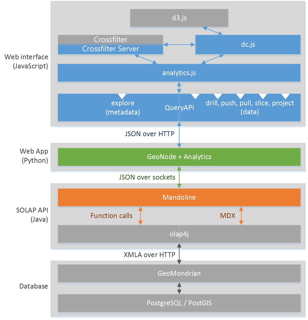
You can see the 4 main components:
- The web interface, which role is to data visualization. It is composed of the packages:
- analytics.js, a package developed that handles all the interface
- QueryAPI, a proxy of the interfaces of Mandoline, the SOLAP API
- crossfilter, a sort of small client side OLAP database
- crossfilter server, a library we developed which allows us to do the same thing as we do with crossfilter, but delegate the OLAP computation to a SOLAP API for server side computation
- d3.js, a library for SVG renderings of charts
- dc.js, a modified version of the original dc.js for charts rendering of multidimensional crossfilter data
- The web app in Python, analytics, delivering the data visualization interface, extending the existing web app GeoNode
- The SOLAP API in Java called Mandoline, with its dependency olap4j, allowing us to query GeoMondrian easily in JSON
- The OLAP database with a GeoMondrian SOLAP server getting data from a PostgreSQL database, doing the data processing
analytics.js
The analytics.js package represent the major part of the work that was done in this project. It is composed of various “namespaces”, each containing multiple “classes”. Of course, all this is JavaScript so “namespace” and “classes” are both objects. Here is the architecture of the package:
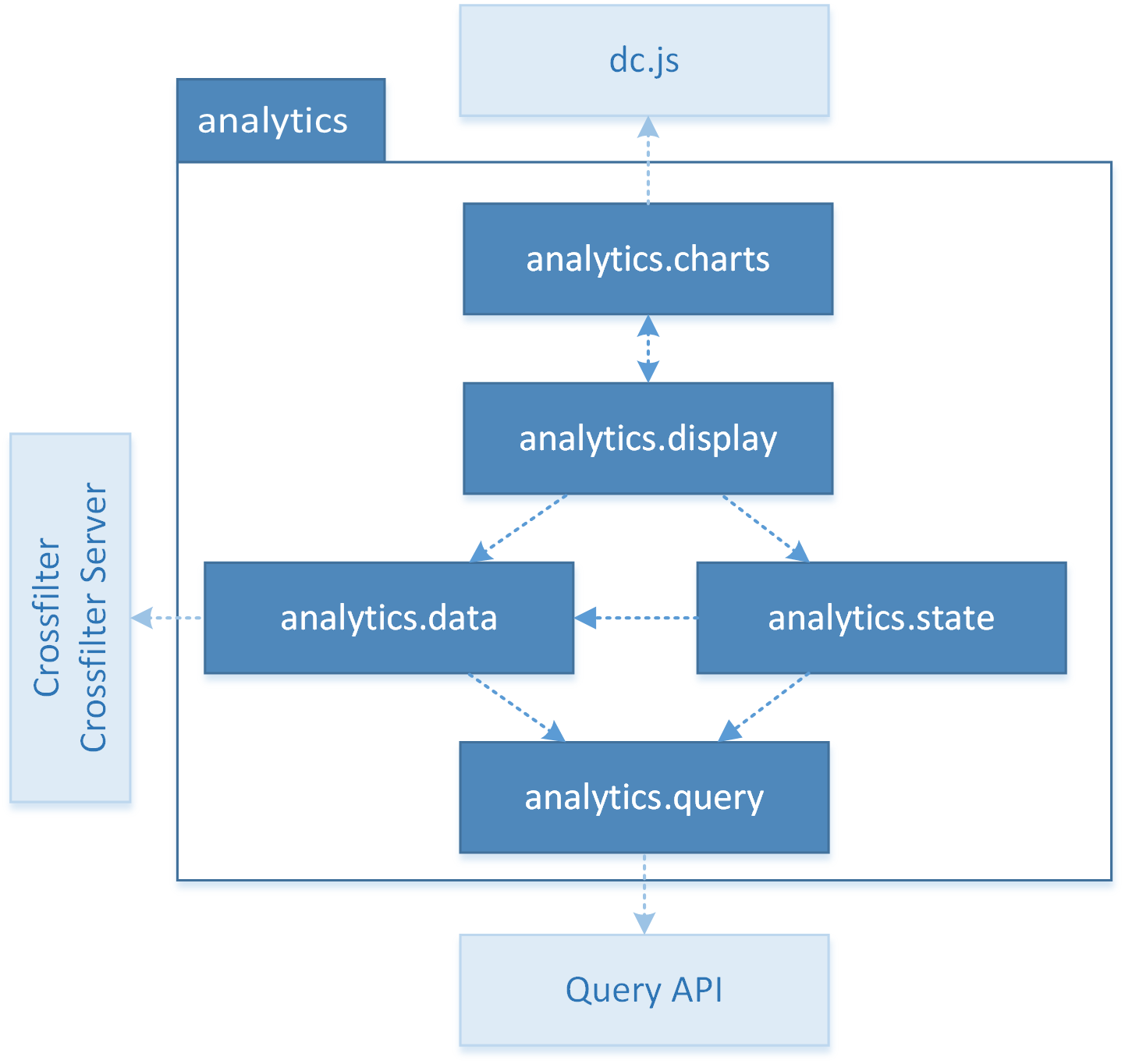
You can see:
- analytics.query simplifies the interrogation of the SOLAP API through QueryAPI by offering specialized functions
- analytics.data offers data types representing OLAP elements and stores the data
- analytics.state stores and gives functions to modify the OLAP state of the current analysis (to simplify, which elements of which level of which dimensions are analyzed)
- analytics.display handles the interface (where is each chart and what is it displaying) and the interactions with the interface
- analytics.charts offers charts classes that can be instantiated when you want to create a chart
Cross-filtering and crossfilter-server.js
One of the major “issue” we had to tackle was to provide an efficient cross-filtering on the interface. You can see this in the demonstration video above. Indeed, the filtering function is very useful for the user to be able to see how data are distributed across the elements of each dimension and explore the OLAP cube.
This filtering function will therefore be highly solicited and should be very efficient while still being able to handle big volumes of data.
There are actually two solutions to achieve this goal that can be represented on the following diagram:
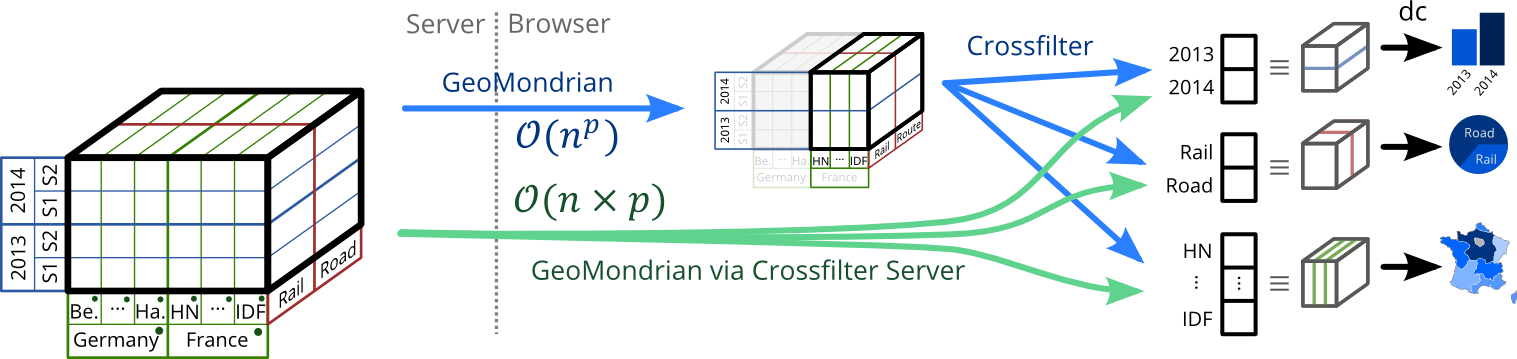
On this diagram, you can see the OLAP cube stored on the server on the left, and the charts we need to display on the right.
First solution: Crossfilter
The first solution is to ask our OLAP server, GeoMondrian, to compute a smaller cube of data containing what we are currently studying. Here on the diagram, the cube in the middle contains data for French regions, years and mode of transportation.
This temporary cube is downloaded in the browser of the user and is then given to the library crossfilter. Crossfilter will then be capable of computing projections of the cube on each dimension, and these projections will be used by dc.js to display the charts.
In this solution, the interface will be very responsive when filtering, because crossfilter already has got all the data he need to compute the projections while taking filters into account. It will take less than a second to compute new projections taking new filters into account.
However, the defect of this solution is that the number of values in the temporary cube is the product of the number of elements studied in each dimension (e.g. for 6 regions, 2 years, 3 mode of transport we have 6 × 2 × 3 = 36 values), and this size grows exponentially. We will only support reasonable volumes because data will eventually become too big to be loaded in a reasonable time.
Second solution: Crossfilter Server
The alternative solution would be to ask GeoMondrian to directly compute the projection of the OLAP cube, after filtering, on each dimension studied, without computing the temporary cube that is too big.
In that case, the size of the data we load is the sum of the number of elements in the dimensions we study (e.g. for 6 regions, 2 years, 3 mode of transport we have 6 + 2 + 3 = 11 values), and this size grows linearly. We will be able to support big volumes because we load much fewer data (as long as GeoMondrian can process those volumes of course).
However, the drawback of this solution is that when the user changes the filters, we need to ask GeoMondrian to compute the projections on each dimension again, taking into account the new filters. This will significantly slow down the interface at each filtering because we need to query the server again while crossfilter only needed to do a few computations locally.
Another issue with this solution is that our chart library, dc.js, is depending on Crossfilter as a data model. We can’t just give it some data.
To solve this problem and make this alternative solution possible, we developed a small library that we called Crossfilter Server. This library has almost the same I/O interfaces as Crossfilter (only the initialization should differ). And Crossfilter Server will be able to reproduce Crossfilter’s behavior without having the full temporary cube, and by delegating all the computation to an API that will, in our case, call GeoMondrian.
Therefore, we can either use dc.js with Crossfilter or Crossfilter Server.
Recap & final solution
To recap, we have 2 possibilities:
Crossfilter
-
Resonable volumes - Quick client side filtering & aggregates (< 10 ms)
Great responsivity
Crossfilter Server
-
Important volumes - Server side filtering & aggregates, reload data ( 1s)
limited responsivity
Our final solution was to use both of these solutions, using one or the other depending on the volume of data you are studying, and switching dynamically from one to the other when needed.
Conclusion
This article is of course a quick summary of a very long project. If you want to know more about this project, you can read the documentation available in the wiki of the GitHub repository and take a look at the code of the components listed above. If you want, you can even contribute to the project by making pull-requests to it.